Turning a Brand Mood Board into Measurable Fixture Requirements
A brand mood board communicates a visual direction, but a fixture supplier needs more than an atmosphere to prepare a buildable proposal.
- Published
- 2026-09-08
- Updated
- 2026-09-08
- Reading time
- 8 minutes

A brand mood board communicates a visual direction, but a fixture supplier needs more than an atmosphere to prepare a buildable proposal. Words such as playful, precise, collectible or futuristic can lead to several different interpretations.
Three decisions to carry into your project.
- 01
Explain why each reference belongs on the board
- 02
Separate the desired effect from the proposed material
- 03
Translate brand adjectives into observable features
Start with the decision
A brand mood board communicates a visual direction, but a fixture supplier needs more than an atmosphere to prepare a buildable proposal. Words such as playful, precise, collectible or futuristic can lead to several different interpretations. The useful next step is to translate each important visual intention into a feature that can be described, sampled or reviewed in the physical store.
This does not mean reducing design to a checklist of finishes. It means separating the effect the brand wants from one possible way of producing it. A sense of lightness might come from spacing, a slender visible edge, a bright background or a transparent panel. Each has different implications. A translation sheet helps the team compare these routes without treating an inspirational photograph as an approved construction detail.
Explain why each reference belongs on the board
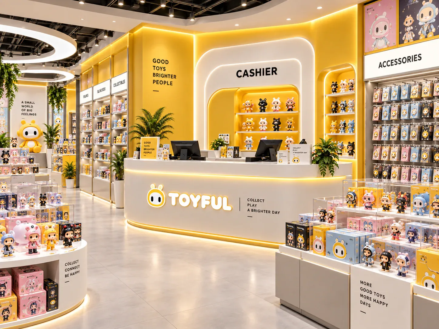
Begin by annotating the references. For every image, complete the sentence “This is relevant because…” with a particular observation. The answer might concern the contrast between a product and its background, the rhythm of repeated bays, a restrained palette or the way a feature display is framed. Avoid an annotation that simply repeats the name of the style.
Identify what is not relevant as well. A reference may show an effective colour relationship but the wrong fixture scale. Another may communicate a desirable material contrast while using graphics that belong to another brand. Explicit exclusions help the supplier avoid copying unintended details and keep the discussion focused on the selected design principle.
Remove references that no longer have a clear purpose. A large board can feel comprehensive while containing contradictory messages. If one image celebrates density and another relies on generous empty space, decide where each approach belongs in the proposed store. They may both be useful, but not necessarily in the same fixture or the same merchandise zone.
Separate the desired effect from the proposed material
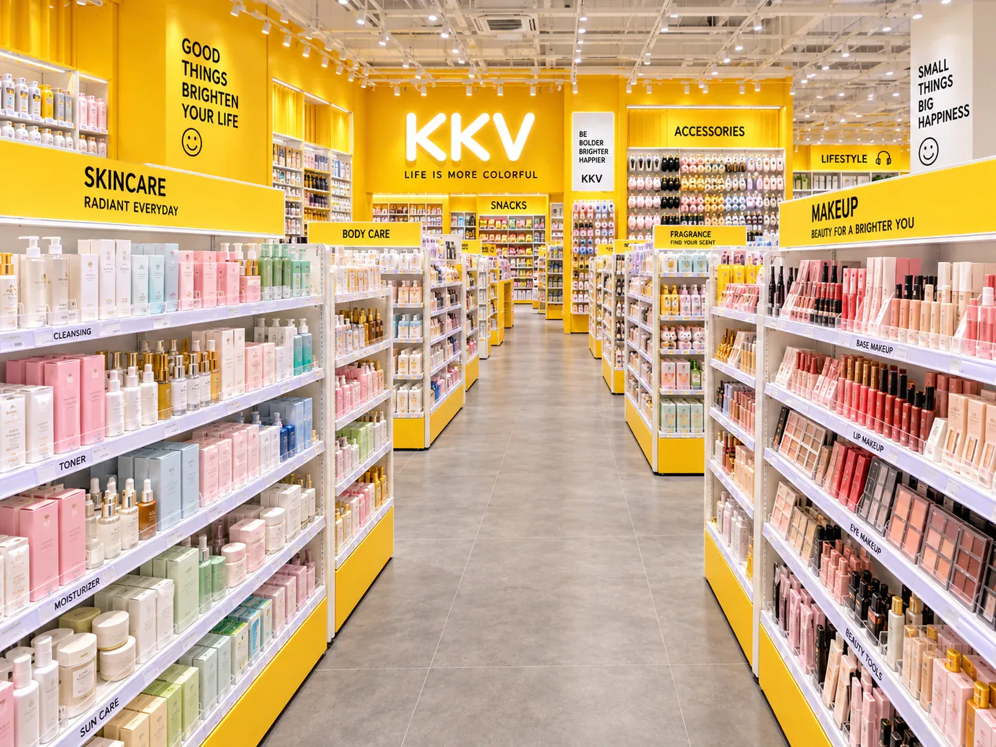
A mood board often arrives with early material assumptions: brushed metal for precision, dark glass for exclusivity, or bright acrylic for playfulness. Treat these as candidates rather than conclusions. Ask what the material is expected to achieve and whether another route could achieve it under the actual conditions of use.
For example, a dark background may make a colourful collectible stand out, but the result depends on the product and the lighting around it. A reflective finish may create an appealing reference photograph while introducing distracting reflections in a different store. The board should therefore identify the intended viewing effect and the conditions under which it will be tested.
Write the effect in a way that invites evaluation. “The figure should remain visually distinct from the rear panel at the intended viewing position” is more actionable than “premium background.” It does not prescribe the answer too early. The team can compare samples or mock-ups and select the combination that performs the intended visual job.
Translate brand adjectives into observable features
Create one row for each important brand attribute. In the next column, describe how it should be perceived in the store. Then list candidate physical features and a method of review. The method may be a finish sample, a full-size graphic, a small assembly detail or a view of actual merchandise inside a prototype.
Some requirements can be measured directly, such as the size of a logo panel or the position of a graphic relative to a shelf. Others need a controlled visual comparison. Do not force every aesthetic judgement into a numerical score. Instead, define the reference, viewing condition and person authorised to accept the result.
Keep the statement connected to the fixture's role. A playful accessory wall and a calm premium showcase can belong to the same brand without using identical treatments. The brand attribute should guide the relationship between elements, not compel every cabinet to display the same colour, outline and amount of information.
See the decision table below for the working record.
Define a hierarchy rather than decorating every surface
A store needs visual priorities. Decide which elements should attract attention first, which should support navigation and which should recede behind merchandise. Without this hierarchy, separate designers or suppliers may make every element prominent. The result can be a collection of individually strong features that compete with one another.
Mark primary brand locations, product-led areas and supporting surfaces on the layout. A feature sign might carry the strongest identity, while ordinary shelving uses a quieter treatment. A launch zone may accept more frequent graphic changes than a permanent wall. These distinctions make the mood board relevant to the whole space rather than a repeatable decoration applied indiscriminately.
Use the hierarchy to manage design changes. If a proposed finish makes a supporting cabinet visually dominant, discuss whether that is intentional. If an information card competes with the collectible it describes, test a different size or position. The question is not whether the individual item looks attractive in isolation, but whether it performs its assigned role in the store.
Create a sample plan that tests the important interactions
An isolated paint chip cannot show every aspect of a finished fixture. Its appearance may differ when placed beside a printed graphic, a metal edge or a light source. Choose sample combinations that represent the interfaces most likely to influence the final impression. The purpose is to resolve uncertainty, not to collect the largest possible box of samples.
For a customer-facing corner, inspect the relationship between surfaces and edges. For a brand sign, compare the artwork at the intended size and orientation. For a display background, include representative merchandise. Explain the expected lighting and viewing conditions so that an approval made under one condition is not silently treated as proof for another.
Record sample identifiers and the scope of each approval. A signed colour sample may approve the colour direction without approving the substrate, edge treatment or complete assembly. Keeping those limits clear prevents a narrow sample decision from being interpreted as permission to proceed with unresolved construction.
A hypothetical translation exercise
Imagine a designer toy brand describing its desired store as calm, playful and precise. The mood board includes a white gallery, a bright sculptural counter and a close-up of a neatly aligned metal joint. At first, the team asks for a bright custom shape on every fixture. This scenario is invented to demonstrate the method; it does not describe a delivered customer project.
The annotations reveal a different intent. Calm refers to keeping loose figures easy to view. Playful refers to a small number of recognisable colour moments. Precise refers to visible alignment and finish consistency. The team can now investigate a restrained showcase background, selected accent panels and a sample of the most visible joint, instead of assuming that every cabinet must become a complex sculptural object.
The translation sheet also reveals a conflict. A highly reflective accent looks attractive in a reference photograph but distracts from the figure in the sample review. The team considers moving the accent to a nearby graphic area or using a different surface. The decision follows the intended visual hierarchy rather than loyalty to the first material shown on the board.
Finally, the brand owner reviews the three sample outcomes together. The approval states which background, accent and joint reference belong to the design. It also records where the accent may be used. This provides a more useful instruction than a blanket note saying the supplier should follow the mood board.
Connect the translation sheet to the drawings
Once a direction is selected, give the requirements stable identifiers. A finish reference should correspond to the relevant component in the drawing or schedule. A replaceable graphic should have an identified position and agreed interface. The supplier should not have to infer which of several similar reference images controls a particular part.
Check the sheet when a drawing changes. A revised panel size may alter graphic proportions, and a changed joint may affect a previously approved visual detail. Those effects do not mean every change requires a complete brand review. They mean the affected requirement should be identified and reviewed at the appropriate level.
Avoid leaving important acceptance criteria solely inside a presentation file. Include them in the project information used for production and inspection. A useful instruction refers to the approved sample and the component it governs, making it possible to compare the delivered item with the intended result.
Resolve disagreement through the stated objective
Visual disagreements often become unproductive when participants use different meanings for the same adjective. Return to the observable intention. If the aim is to keep the collectible distinct from its background, compare that outcome. If the aim is easy campaign changeover, demonstrate the operation. The original adjective should not override evidence that a candidate solution does not serve the agreed purpose.
Keep a record of the selected alternative and the reason for the choice. If the team accepts a trade-off, describe it openly. A visually quieter solution may be chosen for ordinary shelving while a more distinctive treatment is reserved for the feature zone. That can be a coherent brand decision rather than an incomplete attempt to reproduce a reference image.
When approaching BENSON store design, provide both the annotated mood board and the translation sheet. The first explains the direction; the second explains what must be resolved. Together they allow visual ambition to remain part of the project while giving suppliers, reviewers and the owner a practical basis for discussing the physical result.
Compare one controlled basis.
How we apply this decision.
Visual disagreements often become unproductive when participants use different meanings for the same adjective. Return to the observable intention. If the aim is to keep the collectible distinct from its background, compare that outcome. If the aim is easy campaign changeover, demonstrate the operation. The original adjective should not override evidence that a candidate solution does not serve the agreed purpose.
Review BENSON capabilities →What still needs project confirmation.
Use the actual site, merchandise and supplier information to confirm the project-specific arrangement. Illustrative examples do not establish technical suitability.
Prepare the required inputs →Avoid these shortcuts.
- Treating a reference image as an approved production specification.
- Comparing suppliers without identical dimensions, quantities and delivery scope.
- Separating material, lighting or hardware decisions from the drawing revision.
- Leaving packing, local installation and site interfaces undefined.
Before the next approval.
- Explain why each reference belongs on the board
- Separate the desired effect from the proposed material
- Translate brand adjectives into observable features
- Record each open point, owner, due date and required evidence.
Trace the supporting information.
Content review policyUpdated 2026-09-08. AI-assisted buyer guidance; no independent technical review is claimed.
Move from research to a project decision.
Keep building the specification.
Defining the Merchandise Mix Before Designing a Toy Store
A toy store fixture plan should begin with the merchandise the store will actually sell, demonstrate and keep in reserve. A list of product categories is useful, but it does not tell a designer how much space a box occupies, whether a figure needs staff assistance, or how often a shelf will be replenished.
Read next →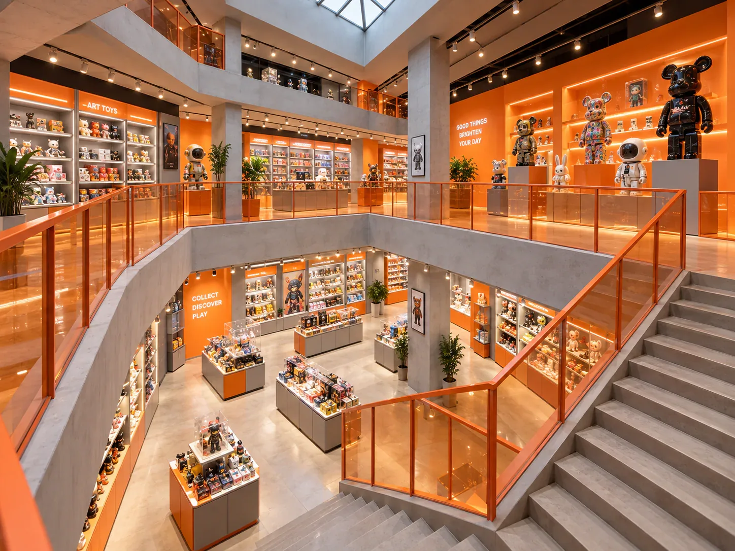
Writing a Store Design Brief for a Designer Toy Brand
A store design brief should explain what the business needs its space to do, which conditions the design must respect, and who will decide whether a proposal meets those needs. For a designer toy brand, that means more than supplying a logo and a collection of attractive shop photographs.
Read next →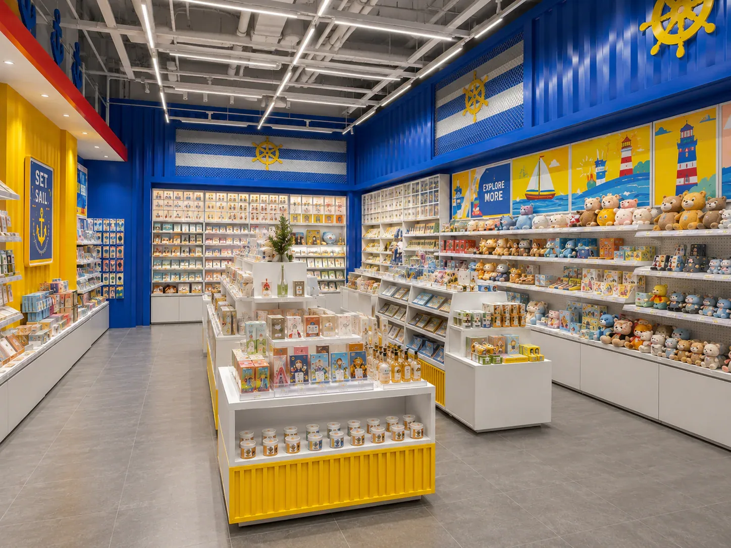
Deciding Which Fixtures to Customize and Which to Standardize
The best fixture programme is rarely the one in which every component is custom, or the one assembled entirely from standard products. A useful choice starts with the job each part must perform.
Read next →Get a project-specific recommendation.
Send your store plan, product sizes, fixture quantities, destination and opening target. BENSON will identify the product fit, engineering inputs and quotation basis.
Start Your Display Project